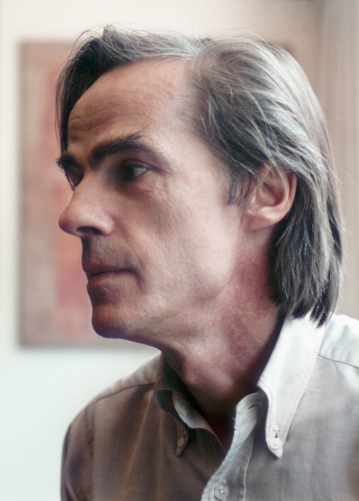
Jean Baptiste Martin-Granel was born on 4th October, 1948, in Charente–Maritime, France.
His earliest memory is the sight of the magnetic blue of a portal in Sidi Bou-Saïd, Tunisia, where his childhood was spent.
Back in France, as a youth, he works with his father, a sculptor and master artist in stained-glass artwork. This apprenticeship, being in constant touch with glass and light, sharing in a spirit of the mediaeval, will draw him towards a style attentive to detail and comprising a small format, while the majority of his contemporaries is working on vast canvasses. He also takes part in the execution, amongst others, of the stained-glass wall of Sainte Marie d’Antony and, on his own, he designs and executes as his own project, those of the Romanesque chapel of the Genétouze as well as those of the “Stations of the Cross” in the Cathedral of Royan.

In 1971, setting aside his involvement with the glass arts, he devotes himself to painting. At this time, he is living in Italy (Rome, Apulia, but mainly in a hermitage close to Assisi where he begins to paint and to set out into the countryside to sketch and draw). In 1973, he has a first contact with Mexico, which will decide him –after two years in Paris— to make home in that country and to become a Mexican citizen. From then on, save for his participation in the fields of publishing and animation, painting is his exclusive interest.
Excluding a course on the al-fresco technique, which he attends invited by Luis Nishizawa, the painter, his formation is that of the self-taught artist. Preferring and needing to paint in the solitude and seclusion of his studio, he keeps aloof from artistic circles, galleries and critics. He shuns the theatre, the cinema and any interference with his inner work. He refuses to have exhibitions and interviews in the belief that if there is anything he has to say, it will be said by the painting itself.
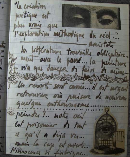
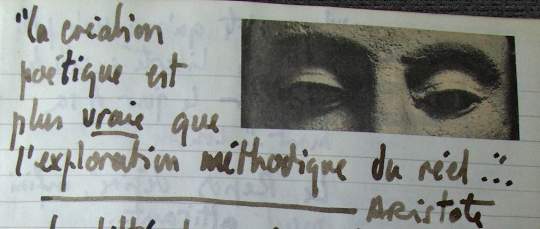
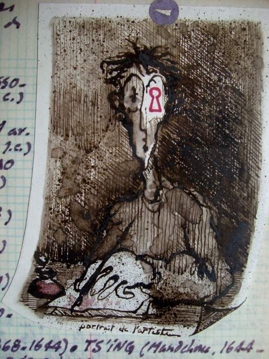
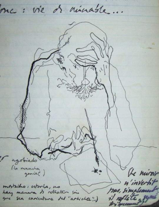
However, he does take nurture from music and literature, aside from his intense personal study of the plastic arts from all epochs. Throughout the years he keeps a collection of notebooks in which he draws, reflects and dialogues with those authors he highly respects and who constitute an ever-present stimulus; thus he includes literal quotes, when they make him recognize and define his own personal quest or when they reveal something that he wants to investigate. Some names stand out and are repeated: Nietzche, Bacon, Alechinsky, Michaux, Morandi, Rilke, but more than any other is the name of Braque. These pages seem to manifest a dynamic “horror of emptiness”: paper-cuttings and collages of a most varied sort alternate with drawings and all types of graphics invading the well–laid–out pages and peppered with humour, at times somewhat macabre.
Under the spell of Piero della Francesca, his oils and water–colours evoke but do not imitate the cracks and flaking layers of an antique fresco. He is set on emphasizing the verticality of the canvass, in other words, underline the bi-dimensional surface plumb against the wall, never being intent on representing depth or perspective. On the other hand, definitely, to allow the elements which uphold and constitute its verticality to be felt or be made visible. That the material on which one paints should be felt and seen, even when that which has been painted is a mere slab, and does not cover the entire canvass or allows it to be partially seen through. He even goes so far as to untwine some rows in the weave of the material (mostly untreated raw linen, but also jute, coarse cotton cloth or even an African textile). In time, this is to derive into the use of torn frayed or sewn pieces of cloth, irregular in shape, painted, or left as is, without a frame.
Attracted by the shades of the “tezontle”, a volcanic rock tinted in the dark red tones of the granate, ever present in the surrounding landscape and Colonial architecture in Mexico, he tears out fragments off mountains, taking them to his studio where he triturates, grinds, and sifts them, thereby enriching his palette of the best English quality with the colours of the stones and sands inside jars aligned alongside the hundreds of small tools fashioned out of bamboo and metal which he makes himself depending on the immediate needs.
His themes? The usual: a fruit, a tree, an agave in the landscape, the woman… all treated as to their essence, barely figurative. Or none of the latter, if the theme is solely an emotion. The love of detail mentioned above, refers to his fine and subtle shading not only as concerns colour, but to the profusion of his graffiti and (the brush that taps) the wealth —whether mineral or ethereal— of his textures.